Our University Emblem—what is it to YOU?
OF COURSE, it’s the VSU Logo and that’s it, but, nuh-ah-ah…think again. If you would try to look around the campus for mock-ups of the symbol and you are keen enough, you would understand why you should. For the lazy many, it would be much of an effort to do so, so just read on.
Generally, a logo is a symbolic representation of an entity, group, organization, or institution. It is a tool for quick recognition for people around. For example, one can quote ‘Unilever’ from the bold and ornate ‘U’ on television commercials; or how about the check mark for Nike shoes? A logo gives a gist of the real identity of the group it represents.
Just the same, our university logo is a graphic symbol that represents our school. This particular logo, even in its earlier forms, has given us a name here and abroad. It’s an ‘Uy! That’s ViSCA/LSU/VSU!’ at a glance—a feeling of respect and awe to this center of excellence in agriculture, engineering and forestry is immediately embraced by its viewers. This is the reason why the VSU logo is of great worth to the university itself. It is important and therefore should be a must-know to every VSU constituent especially to us students.
Unfortunately, many (if not most) are unaware of the goings-on of this popular emblem. Most even give an unconcerned ‘ma-at-pa’ (malay ko at paki ko) attitude towards it. The existence of these people is bad news; but for those who want to know, well…ready, get set, (lo)go!
Humble Beginnings
ViSCA Logo (1974-2001)
The first form of the university logo was the ViSCA logo, which was then a college logo. The brainchild of the artistic Fernando A. Bernardo, the first ViSCA president, it was executed by Domingo ‘Noy Bebot’ Flandez. This historic birth happened just after Presidential Decree No. 470 converted Visayas Agricultural College (VAC) was enacted converting Visayas State College of Agriculture (ViSCA) in 1974.
The ViSCA Code (Book I, General Provisions, Section 7) stipulates the specific details of the logo:
“The seal of the college shall be square with rounded corners. It shall be 1½ inch across the parallel straight sides with an inner square about ¼ inch from the outer square. The space in-between the squares shall bear the inscription “Visayas State College of Agriculture.” A circle shall fit into the inner square. This will be followed by an inner circle 1/8 of an inch away from the outer circle. The space between the outer and inner circles shall bear the inscription “Work, Truth, Knowledge, Relevance” with “1924” enclosed in parentheses at the bottom and “1974” at the top. Four interlinking figures, each one about 1/8 inch wide, form a square which fits into the smaller circle. Four arrows forming a circle are found inside the square formed by the interlinks. These symbolize cooperation, dynamism and systems approach to problem solving. A solid circle about 1/8 inch in diameter marks the center of the seal.
“The foregoing proportions shall be followed in any enlarged- or reduced-size drawings, cut-outs or mock-ups of the college seal.”
It was a strong emblem to raise up a strong institution.
“This is my vision for ViSCA,” Dr. Bernardo marks, “This is how I want this school to be.”
That is why the great leader has put much valuable elements into the logo. And the seal also incorporated the college colors which are green and gold symbolizing growth and development. From there, the logo, in its own way, spurred ViSCA from being a small rural school to a world-renowned college.
And so it was. For about 26 years, this logo appeared in ViSCA’s vehicles, buildings, diplomas, official papers, and the likes—until in 2001, ViSCA officially became a university: Leyte State University or LSU, through RA 9158.
Dynamic Changes
LSU Logo (draft)
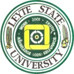
Of course, the new name called for a new logo. It was a tough time breaking through for a new look. The top officials of this institution convened to facelift the symbol. It was difficult; many people wanted to include a symbol for their college within the logo. This phenomenon is similar to the logo of the College of Agriculture (as if they’re making a pizza pie). At last, former President Paciencia Milan resolved not to give in to the badgering: the logo can exist without these and still identify the university as a whole.
Finally, LSU came up with a new logo. After several warmed (if not heated) sessions in the University Academic Council, and with the artistic ability of ‘Noy Bebot’, and some ideas by a top few, a new and fresh logo surfaced.
LSU Logo (2001-2007)
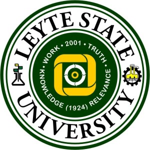
“Making the new logo wasn’t really difficult,” Noy Bebot narrates. “All it took was to change the shape of the logo from a round-cornered square into a circle, put in the new name, and add the symbols for ‘agriculture’ and ‘industry’ which Ma’am Milan and Sir Manny [Palomar] suggested. I retained the motto, the soft-cornered square symbol, the arrows and the central dot—for continuity with the past.”
It was more or less similar to the old logo. The ‘continuity with the past’ was a smart move, because a radically different design would be difficult to recognize. All it took was to enhance what has been nakasanayan. We don’t need to drastically break away from tradition just for the sake of change, that’s why it was good to take advantage of the familiarity. ViSCA was recognized internationally with its square shape and the four-interlinking columns. Even townspeople could quote ViSCA from afar with those figures.
Ironically, that ‘square’ shape was so non-conformist for a school logo (cold, stiff, boring) so changing it into a circle promptly describes its change into a university (universal, well rounded, versatile).
The rice and coconut icons at the flanks were ‘revved’ up to a plant in a flask, and a gear with somewhat like a factory and a farm field inside it, at the left and right, respectively. These changes bring into mind the role of science, research, development, and technology in contemporary times, and leaving manual labor (e.g. pilot sa lubi) to more modern means.
Surprisingly, although this new logo has been considered official since then, no resolution or official document has been issued declaring this logo as the new one.
“The administration only passed the logo to the Board of Regents for information and not anymore for approval,” notes Prof. Daniel Tudtud, the University Secretary. “That’s why the BOR has not released any resolution regarding it. Moreover, LSU was just an interim state of the school, because by the time we became LSU, a bill was already pending in Congress that would convert us to Visayas State University.”
And that was RA 9437. The act legitimized the conversion of Leyte State University to Visayas State University as a reflection of its broadening scope as an institution of higher learning. Since the now Visayas State University cannot carry about an LSU logo (as deemed logical), there came a need for a quick fix on the emblem. The administration announced a logo contest for a new logo by the summer of 2007. Entries with weird shapes and profuse icons flooded.
Noy Bebot remarked, “These entries are packed with all these gears and unneeded symbols. Gears would make us appear like an engineering or trade entity, while all these icons are too much. In my opinion, these are not good for the logo. So along with Ma’am Milan and a few administrative officials, in this case, we managed to remodel it, but with minimal changes.
“Basically, the ‘Leyte’ in the circling name was changed to ‘Visayas’ (of course). Moreover, the ideals were removed, while the remaining shapes were stretched to fit to the inner green circle. The founding date, however, was retained and put in the bottom of those shapes.
“Finally, the central dot (actually a circle) was changed from yellow to brown, reflecting the human element of this university.”
This new makeover, however, bypassed the bureaucracies in coming up with the university logo. There was this hey-we’re-VSU-na craze around campus so there came a ‘need’ of having to have a new logo, so a chosen few avidly worked behind the scenes for this job.
Well, it is a consolation that the logo contest didn’t continue this time. Renante ‘Tommy’ Tomas, a former editor of the Amaranth, saw the best reason why it shouldn’t:
“I don’t suggest having logo-design contests, because often poor symbols are made that way—the winner tends to be the best of the mediocre.”
Amen to that…
Anyway, this new logo finally came out. This model made its way again to the documents, new ID’s, and painted on university vehicles and buildings. By August 2007, this logo appeared in two large markers beside our main gates, and was also unfurled during the University’s 83rd Anniversary Convocation. Although having received much publicity, the green and gold (and brown!) did not live in a peachy world.
Refining Short Comings
The new VSU logo elicited praises, raised brows, harsh comments, and many other criticisms. By the time the changes from the transition surfaced, the logo faced the test of many a watchful eye. People in and out of the university had something to say about the other changes, big or small, made in the new logo.
People had difficulty determining the meanings of some two minor changes in color: the central dot changing from yellow to brown, and the topmost leaf in the plant at the left turning green to yellow. Oh well, for the information of those wondering, the brown central dot or circle symbolizes humankind and its immediate environment as the main target of the university’s endeavors, and the yellow represents growth. But naturally, shouldn’t the sprout be the greener one? Meanwhile, Prof. Tudtud states that there was no such thing as the green-to-yellow leaf change since it had been yellow even in the LSU times. But how come some LSU logo models had them green? Strike one for that inconsistency around campus.
Other than that, well, the deletion of the motto or the ideals (Work, Truth, Knowledge, and Relevance) brought forth perhaps the biggest stir regarding the logo here in campus. This deletion was made with the notion that mottos easily change, and it usually does. And if we consider rules in visual design and disregard the intellectual value of this motto, this move would have been acceptable since it is considered as ‘extra visual baggage’ to the logo and barely legible when the logo is reduced to smaller sizes (especially with a 1-cm radius, the bureaucratic size for municipal seals).
Visual baggage, eh? Then, we might be wondering why the founding date (1924) remained. We don’t really need to put founding dates (how about expiration dates?) in our logos, because it does make the logo older than it appears. It is just a relic of the pompous notion that the older the organization is, the better it is—such an outdated concept. But we know in this age of booming advancements that age no longer spells e-x-c-e-l-l-e-n-c-e all the time. Yes, we celebrate the founding year because this is when our institution was born, but do we really need to put it “in case we forget”? And besides, this retention became an avenue for the second strike on inconsistency.

Early VSU Logos including the off-centered model (above) (2007)
This is the off-centering of the interlinks in some mock-ups: the founding date below pushed it up top. I can hypothesize that this occurrence can only be distinguished by a trained eye because apparently most of the offices continued to use the off-centered one.
“In the rough draft, [the logo] wasn’t like that. Perhaps, it’s a glitch in digitalizing the physical,” says Noy Bebot. “To rectify this, I went to the ‘top’ and told them it is not right to do it that way. So I suggested reducing the founding date’s size so it won’t interfere with the other elements.”
So there were two ‘mutants’ circulating in school publications and other property: the off-centered logo like in USSO papers and the ID’s made by the registrar, and the ‘balanced’ logo with a teeny-weeny ‘1924’ below which was mainly used by the Office of the President. Say, how’s that for readability? Oh well…
Here, we can conclude that proper dissemination of information prevents such inconsistencies. If adequately informed, people such as graphic artists and painters from the PPO could have avoided making faulty models of the logo. Legally, such improper handling can be sued on the basis of Intellectual Property Rights (IPR’s): mutilating a logo, a design, or the like is against the law. To be safe indeed, it all boils down to being properly informed.
Fortunately and however, the logo is no longer official. Has it ever been? Yup. RA 9437 thundered the university by summer 2007, effective the school year following. Thus, the symbol sheepishly was somewhat a product of hasty adaptation, especially that the 83rd VSU anniversary was then nearing. So then again, the administration ‘informed’ the BOR of this new model. Considering the rashness of how the university came up with this logo design, the need for refining appears to be good call. And that is exactly what they did.
It is no longer official since the administration has already come up with—tuhdaaahhh—’VSU Logo Ultimate’.

VSU Logo "Ultimate" (2007-present)
President Joe Bacusmo, in the 33rd BOR meeting held at LNU on 23 November 2007, suggested that the institutional ideals be reintegrated in the University Medallion and Mace. In short, the motto is coming back.
So, would this be for real na? Unsa man jud? We have to know for a fact that the President has formulated a committee that would look into the management of the university logo. As of now, the chairman of this certain committee has informed that they are still looking into this ‘suggestion’ and whether they would adopt this or not. (They haven’t met yet—shouldn’t this be a matter of great urgency?). But we should know that it would be Mr. President who will have the final say even over any decision this committee will make (say, he’s the president). Moreover, since the Office of the President is currently adopting this logo with the ideals reintegrated, then the university must do something to avoid any more inconsistencies around—an official announcement will do. Different offices using different versions sure do incite confusion among the university constituents.
This version, which includes again the motto, with a yellow central dot and yellow topmost leaf, is the latest and acknowledged version of the VSU logo. If nothing changes, this will be the university emblem that will be officially adopted in the near future, to carry on its noble task to represent and to challenge. There it is—that is the VSU Logo Loco, truly living la vida loca! But before I end this article, allow me to give you something to contemplate…
This institution is only as good as its symbol. Without proper care in handling, the VSU logo might fail in its role in giving a strong image to the world. And without guided knowledge of what it really is, the VSU people (that includes me and you) are going to cause the logo to do just that. This goes first to graphic artists who ‘digitalize’ the ideal and the PPO workers who ‘materialize’ the digital. And then it goes to everyone else—you and me. That is why we should be able to comprehend what is happening with it.
VSU Logo Makeover

VSU Logo Makeover
THERE IT IS—what you see above is perhaps the best way of immortalizing the university logo. While there is the same recall with the old, some elements have been removed because they constrain the symbol from maximizing its simplicity and versatility.
This is just a suggestion. This proposition might offend some people (it can’t be helped) because of fussing with what is already there, but let me clarify my point: the thought of a better model is exciting when change is possible. As the computer industry emphasizes: there is always a next version. And here it goes…
Simplicity is important because we are in modern times. In an age of bombarded advertising and shorter attention spans, winners succeed by a matter of seconds (three is ideal). While the current university logo is okay aesthetically, the message cannot sink in that fast because it is ‘visually heavy’ because there are many elements in it. In contrast, this new model is ‘light’, needing less eye effort since there are only simple shapes that compose the whole figure. Simplicity is beauty.
This model has eliminated a number of elements, particularly the name, the ideals, and the founding date. Not including the name would prevent the logo from changing again in case this university would go through another transition. The motto? They usually change—same principle applies. How about the founding date? Uh—it looks like an expiration date—no need to put it too (like anyone but us care). Nowhere has it been written in stone that the logo should say everything.
With simplicity, the logo can then be more versatile. What do we mean by this? It can work at its best anytime, anywhere and anyhow. It does not lose its fidelity and composure even when converted to black and white or reduced to very small sizes. It can appear formal and at the same time look ‘cool’. (That’s why young people don’t like showing around school logos because they are either dull or pompous—yuck!) And most of all, it can go in official document headers and the like without being redundant with the school name. Wouldn’t it be neat?
What can we learn here? It shows that logos need to be restrained to work effectively and be tasty (only pizzas work the other way). Simplicity and versatility are actually principles adopted in the commercial world. Anyway, education is still commercial whether we like it or not. And the thing is—without being simple and versatile, logos cannot cope up with the ever changing world of designs and styles. The keyword there is ‘timelessness.’
A Powerful Template
Removing the name, ideals and the founding date is not really a problem. For the sake of the fidelity of the symbol, they need to be taken out of it but it does not mean they go down the drain. These information are of prime importance of the university, however the logo doesn’t need to tell everything about them. So how do we still accommodate them?

A template for the proposed VSU Logo makeover.
Here’s a template that includes all of them along with the logo. By sticking around with the symbol only whenever appropriate, they save the logo itself from changes whenever they change—a new school name, or an improved set of institutional ideals.
And this template can be used in a variety of ways. Maneuvering its layout a bit and you can make a good letterhead. That itself can be a good precursor for a better ID template. It can also be made into markers, painted into buildings and vehicles, or made into stickers, banners and painted to shirts.
But this doesn’t mean that the logo will always go in this figure, nor the whole thing is the logo itself. We must use either of the two in the appropriate situation it is called for. We must adapt in order to be visible in this competitive arena of recognition and advertisement.


